
The Secret Top Brands' Use to Build Unbreakable Trust
The Secret Top Brands' Use to Build Unbreakable Trust
Read time: 3 minutes, 15 seconds

Hey there!
Welcome to The Creative Box. The go-to source for all things related to creating and refining your brand image.
Here’s what we’ll explore in today’s edition:
An breakdown on how Apple creates trust with its customers
The recent re brand of Eurostar
Links to interesting resources and tools
Deep Dive Of The Week
Have you ever noticed something interesting about the Apple brand?
Pick up an iPhone, visit their website, or Google up their ad…
You’ll always notice something.
It feels a part of the same brand.
What do I mean by that?
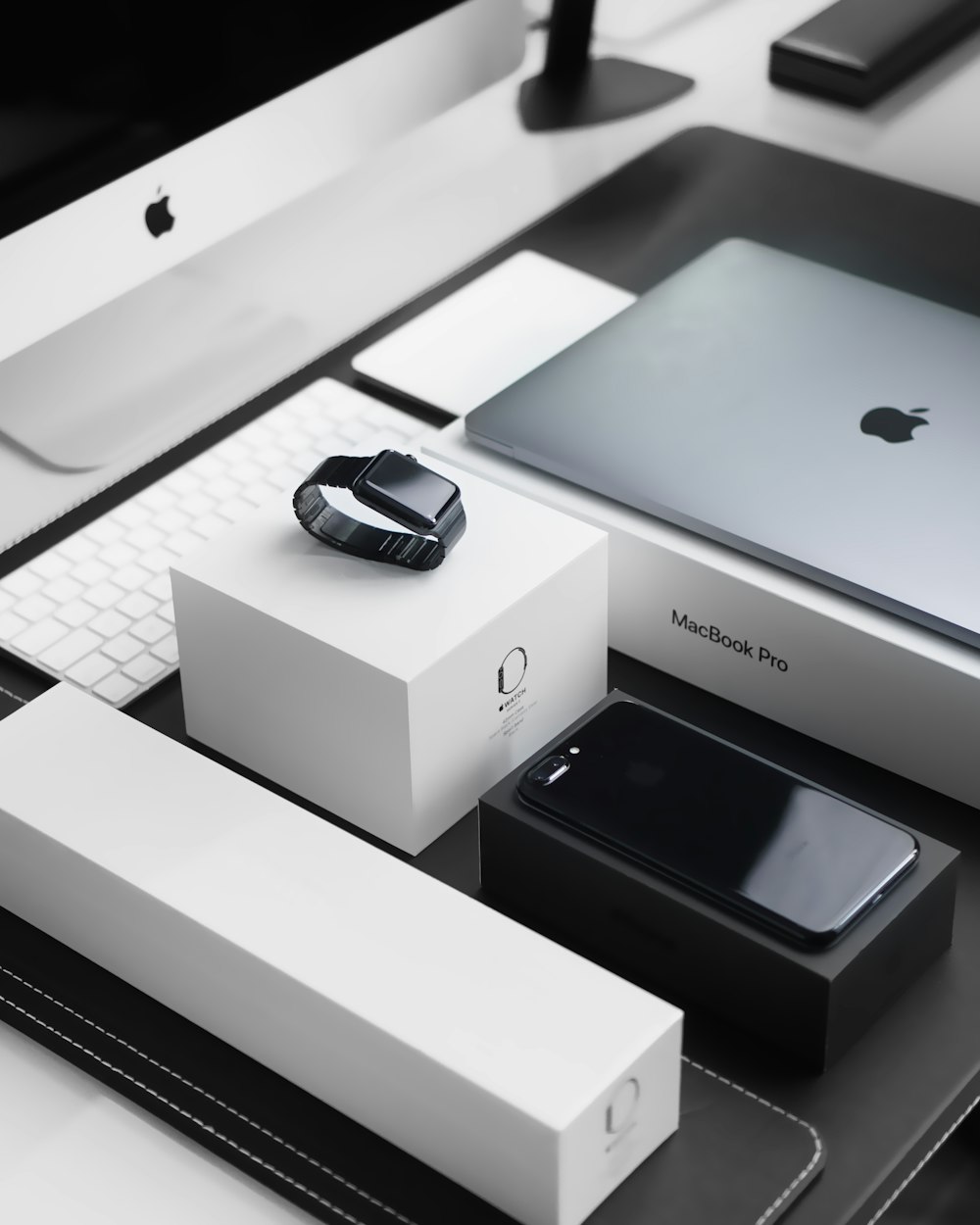
Apple has a built a brand image of being sleek, minimal, and elegance.
Those qualities are reflected everywhere.
Literally.
From their packaging, marketing, website, and products - you can JUST tell that belongs to Apple, even if you remove their logo.
Now imagine if you order an iPhone and it comes in this packaging…

Yeah, not ideal.
It instantly feels off-brand and icky.
If you haven’t caught on by now, CONSISTENCY is key.
In other words, it helps creates trust.
It’s what allows your customers to keep coming back to you over and over again.
But how does being consistent make your trustworthy?
Consistency creates predictability
When a brand sticks to delivering the same message, product, and values over and over and over…they become predictable.
…and that’s good.
Why?
Because customers know what they can expect.
They know you’re not going to completely change your product lineup, values, or brand unannounced in a day.
Think of it like this, when you go to your favourite pizza joint they always have that ONE pizza that you love.
No matter the day, time, or occasion, you can have that pizza anytime.
Now imagine they decide to remove that pizza from their menu and start selling Thai food instead.
You’ll feel angry, shocked, and confused.
So, when a brand consistently presents itself in a certain way, customers come to expect certain qualities and experiences from the brand…
…And this builds trust over time.
If you’re looking to leverage this then you need to be consistent with your brand.
…At least to some degree.
This might look like using the same visuals, colors, fonts, promoting the core values, sticking with the same messaging, and so on.
Do this over a long period of time and you’ll build a solid and unbreakable trust with your brand (unless you stab them in the back or something 😳)
Design Dissection
In each edition of The Creative Box, I share my thoughts on the latest developments in the design and branding Industry.
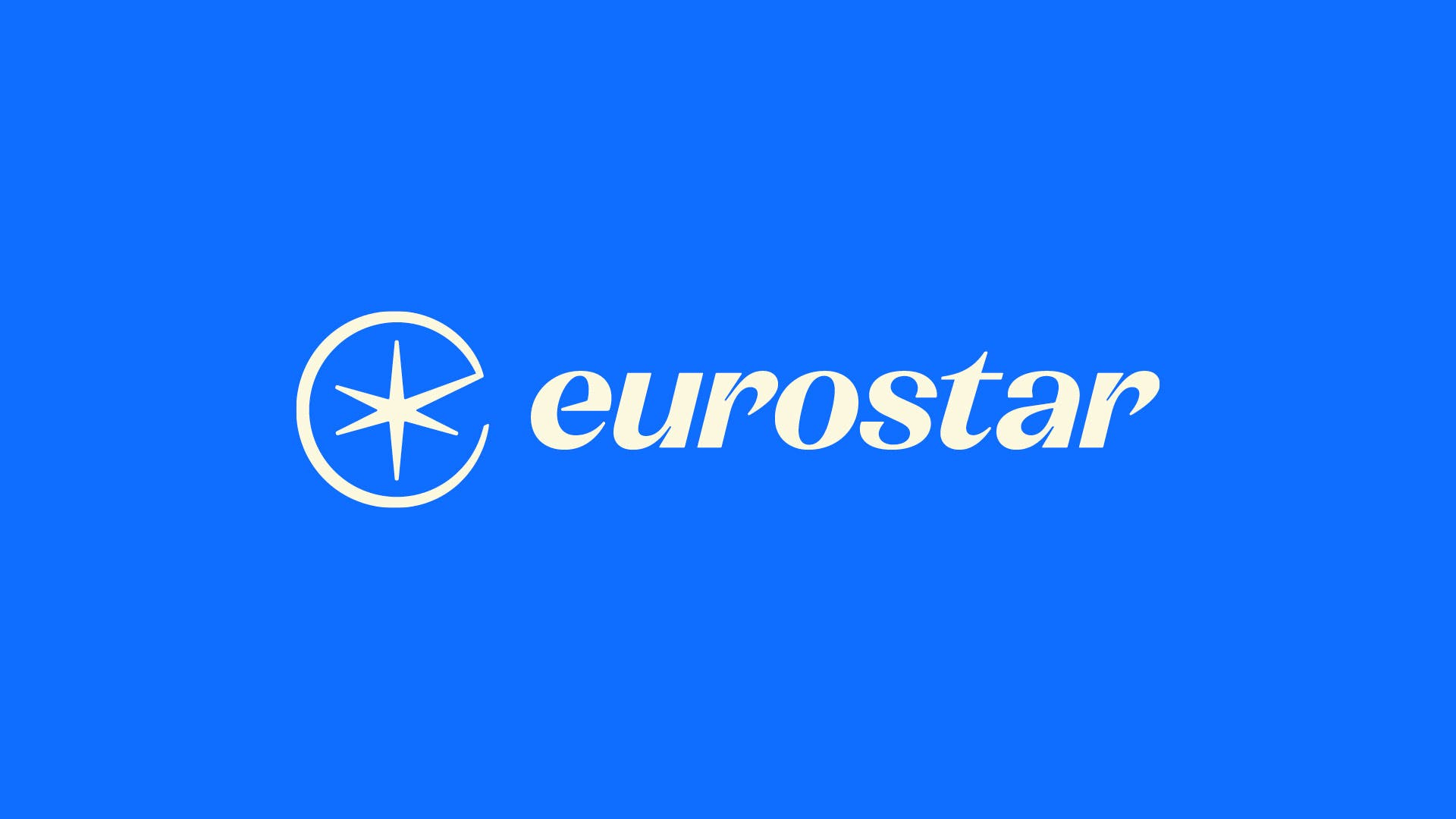
Recently I happened to stumble across the re brand for Eurostar.
I gotta say this is the best thing that could’ve happened to the logo considering the previous one 😬

Yikes!
I have to admit, the new logo did take a while to sit with me but once it does, it’s a work of art.
Here’s why.
Eurostar is a train travel network connecting most of Europe.
It lives by the idea of “Spark New Experiences”
This is beautifully reflected in the logo as an abstract spark symbol.
Not to mention the logo forms the lowercase version of the letter “e”.
Pair this with the beautiful illustration and branding; and it’s a recipe for success.
![[optimize output image]](https://substackcdn.com/image/fetch/f_auto,q_auto:good,fl_progressive:steep/https%3A%2F%2Fsubstack-post-media.s3.amazonaws.com%2Fpublic%2Fimages%2F6a63eb30-ad99-486f-9f9b-6e61e7d3ef15_600x338.gif "[optimize output image]")
Overall, it’s a solid identity with a clever and versatile use of the symbol. Love it.
Designer's Toolkit
IconSax - One of my absolute favourite icon packs. Clean, minimal, and comes with 1,000 icons with 6 different styles.
El Messiri - Fonts like these are timeless! The curves and edges are a beauty. (If you’re seeing it in Arabic, try changing the language)
Neo Brutalism - Launched a Framer template earlier this week! Check it our if you’re interested. (Shameless Plug)
Landing Love - If you’re into animations for the web, you’ll love this one.
Sidebird - Neat tool to create and schedule tweets in a Notion inspired UI.
If these newsletters are starting to feel like a snooze fest, it's time to hit the unsubscribe button.
No hard feelings though, we'll still be friends even if my emails aren't your cup of tea.
Until next week 👋
Cheers,
Ashar