
Why the hell do you even exist?
Why the hell do you even exist?
Read time: 3 mins

Hey there!
Welcome to The Creative Box! This newsletter is your go-to source for all things related to creating and refining your brand image.
Here’s what we’ll explore in today’s edition:
Why the hell do you even exist?
3 BOLD Branding tips (New)
Useful tools to 10x your productivity
Deep Dive Of The Week
Why the hell do you even exist…
...besides making money of course?
This is a question you need to ask your brand.
Let’s say you’re someone who supports the use of Electric car…
You’d be attracted to a company that equally cares about them as much as you do.
And that’s what will create a match.
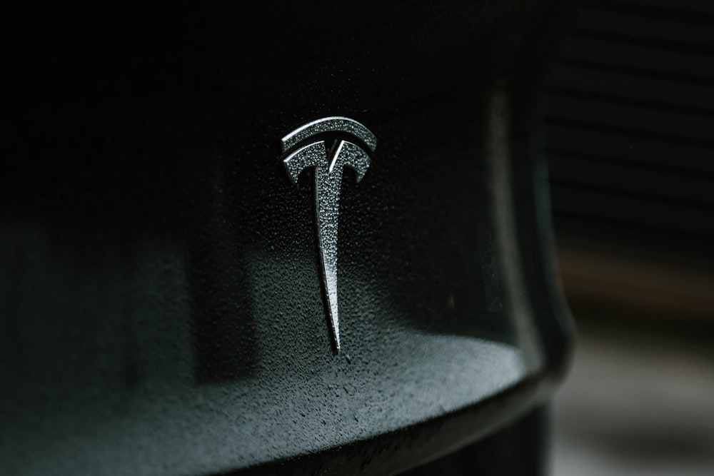
But, imagine Tesla tweets:
“We don’t care about the environment or the electric cars. We just want to make shit tons of money”
Everyone will be looking at the next electric car company that cares more than just the profits.
The truth is, many companies exist solely to make a profit.
And while there's nothing inherently wrong with that, it can sometimes lead to a lack of purpose and authenticity.
As consumers, we want to feel like the companies we support and care about are the things we care about.
Whether it's the environment, social justice, or something else entirely, we want to know that the brands we choose to align ourselves with share our values.
So, as a business owner or marketer, it's important to define your brand's purpose beyond just making a profit.
Ask yourself:
What do you stand for?
What values do you hold dear?
And how can you communicate those values to your customers in an authentic and compelling way?
Let the brand purpose drive you instead of the money.
Design Dissection
In each edition of The Creative Box, I share my thoughts on the latest developments in the design and branding Industry.
Usually, I take one recent re brand and expand on it.
But In this edition I’m switching it up a little.
I wanted to provide more practical knowledge, so I’ll share 3 ideas of bold branding example and how you can use it in your branding.
Ready?
Let’s go 👇
Type matters
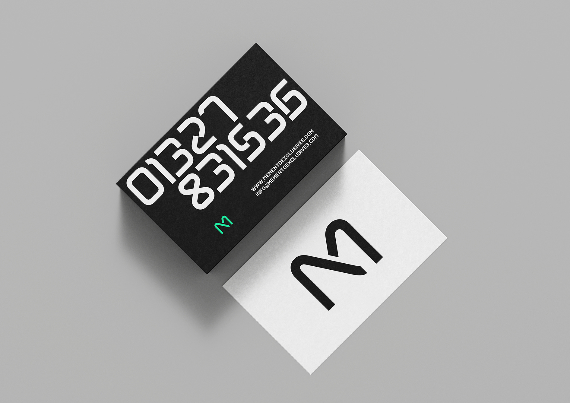
This example of Adelaide ’94 is a great reason to show why type matters.
Be different from the rest.
Choosing a unique font can grab attention even with a minimalist style.
Ensure you go for astronomically large sizes to make an impact while staying minimal
Vibrant. Always.
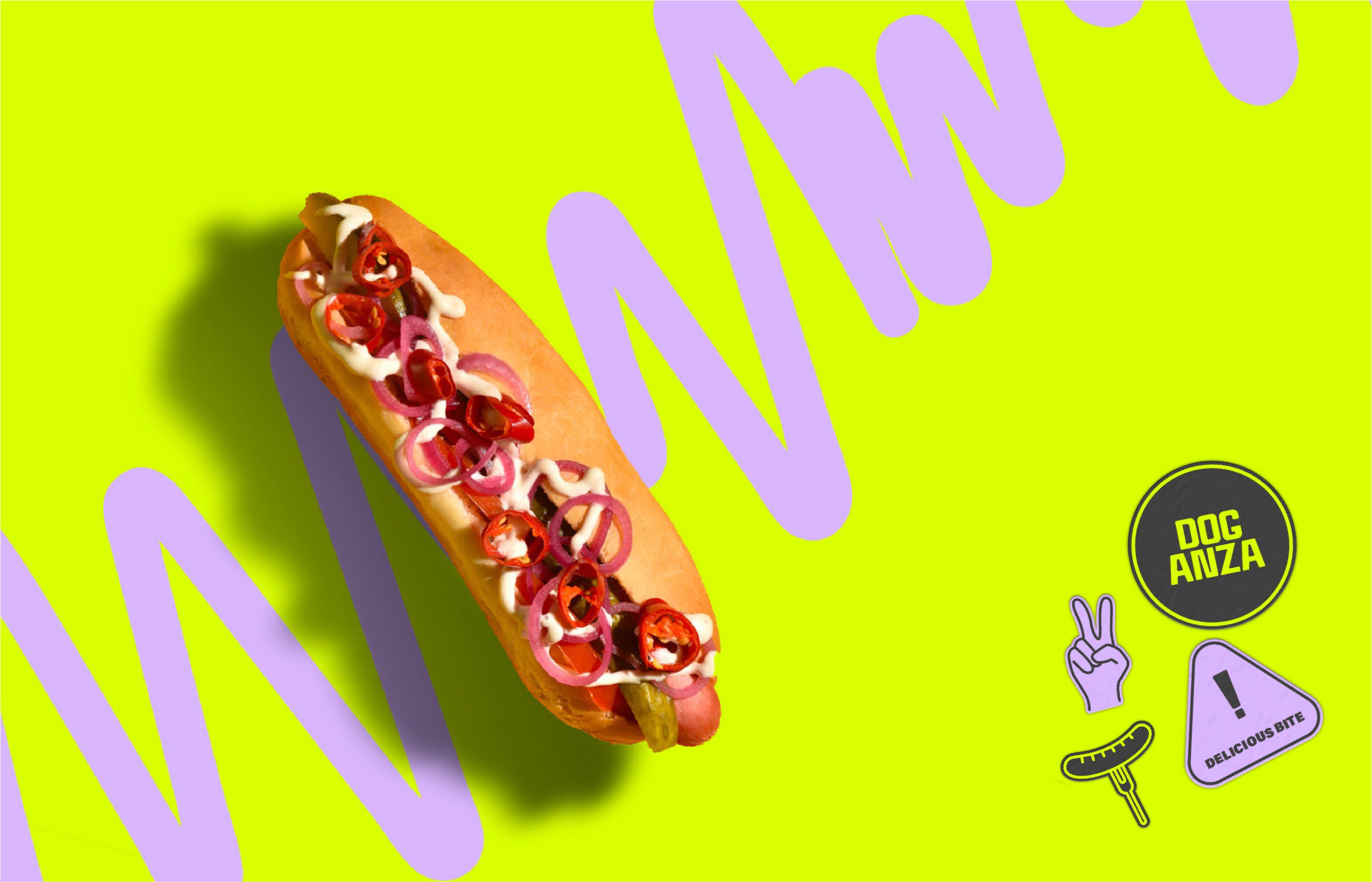
This example of Doganza shows how to stay minimal with bold colors
Break away from your usual palettes
Bright, saturated colors such as lime green, electric blue, shocking pink, and vibrant purple can help you stand out.
Add a contrasting color as a background pattern for interest.
To mask or not to mask?

This example of LaboShop is a great example of masking images.
Masking: Placing an image inside of a shape
Super cool and underrated technique to get heads turning
Try picking shapes directly out of your logo as that’ll feel more on brand rather than using random shapes
Designer's Toolkit
AI Colors - The name says it. A useful tool to generate color palettes at the speed of light!
Designer Daily Report - Everything you need to know about design in 5 minutes everyday.
AI Finder - With so many AI tools, here’s a nice directory to find the best one for you.
Absurd Illustration - A free illustration pack with a gritty, hand-drawn vibe to it.
I’d like to ask you a favour.
I tried something new this newsletter with Design Dissection.
Did you like it or not?
Do you prefer me to go through one project and share my thoughts or multiple projects with shorter but more actionable points.
I’d appreciate if you can reply to this email or comment (on substack) which one you prefer. It takes only 1 minute to do so. It took me 3 hours to write this :)